Archyl on Mobile: Your Architecture, in Your Hands
Architecture documentation has always been a desk activity. Big diagrams, dense tables, a dependency graph that needs a 27-inch monitor to make sense. So when someone pings you on Slack — "wait, does the checkout service talk to the ledger directly?" — and you're on the train, you say "let me check when I'm back at my laptop."
Not anymore. Today the entire Archyl app works on your phone.
Not a cut-down companion app. Not a read-only viewer. The same Archyl, the same account, the same data — every surface reworked to fit a screen you hold in one hand.
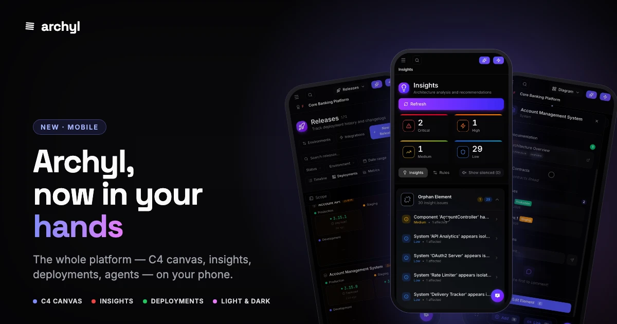
The hard part: the C4 canvas on a phone
An interactive architecture diagram is the last thing you'd expect to work on mobile. Nodes, edges, four levels of zoom, a details panel. We didn't shrink it — we rethought how you touch it.
- Pan and pinch the real diagram. It's the actual React Flow canvas, not a screenshot. Drag around your systems, containers and components.
- A scrollable level breadcrumb. System Context → Containers → Components → Code sits in a glass bar that scrolls horizontally, so the deepest levels are always one tap away even on a narrow screen.
- Double-tap to dive in. Tap a node to select it; double-tap to drill into the next C4 level — the touch equivalent of the desktop double-click.
- Tap for a centered details panel. Instead of a panel jammed against the right edge, the element details (description, owners, ADRs, docs, API contracts) open as a centered sheet sized for your thumb.
- Minimap out of the way. On mobile the minimap hides automatically to give the diagram the whole screen.
Navigation that fits your thumb
The sidebar becomes a drawer that sweeps in from the left — organisation switcher, team switcher, and the nav grouped into a tidy accordion so you're never scrolling past twenty items to reach Projects.
The project header earns its space back too: the action buttons collapse to icons, and all the section tabs — Diagram, List, Decisions, Docs, API Contracts, Releases, and the rest — fold into a single dropdown. The project name and its maturity grade get their own compact row, so you always know what you're looking at and how healthy it is.
Every surface reflows
This wasn't a one-page job. We went screen by screen:
- Deployments — the deployment matrix used to need sideways scrolling on a phone. Now it restacks into clean per-app cards, each environment laid out in a grid, drift flagged in amber.
- Decisions (ADRs) — list rows give the title its own line so it stops collapsing to "Cho…", with status, date and links wrapping neatly underneath.
- Insights — the severity counters (Critical / High / Medium / Low) reflow into a roomy 2×2 grid instead of four crushed columns.
- Technology Radar, Documentation, API Contracts, Releases, Global Architecture — all reflow, with their filter panels and folder trees moving into mobile drawers.
- Account — Profile, API Keys, Notifications and MCP Server share one swipeable tab bar.
Run your agents from the platform
The Agent Hub came along for the ride. Dashboard, Rules, Runs, Schedules and Connectors live on a scrollable tab row, and — the fun part — you can watch a managed agent run execute from your phone: the tool calls streaming in, the inputs and outputs, the "Agent is working…" as it detects drift and opens a pull request. Architecture maintenance, happening in your pocket.
Light and dark, naturally
Everything respects your theme. Whether you're on a bright platform at 9am or in a dark room at midnight, the diagrams, cards and panels look right.
Nothing to install
There's no app store, no download, no separate login. It's the same Archyl you use at your desk — open it in your phone's browser and your projects, models and decisions are right there. Add it to your home screen if you want it one tap away.
Architecture isn't only relevant when you're sitting at a desk. The questions come at standups, in hallways, on the train. Now the answers come with you.
Open archyl.com on your phone and see your architecture in your hands.